Creating Impact: Essential Design Principles for Unforgettable Business Signs
Standing out in today’s competitive business landscape requires more than just a great product or service – it demands a compelling visual presence that begins with your signage. At Pegasus Signs & Printing, we’ve spent years perfecting the art and science of sign design, helping businesses create lasting impressions through thoughtfully crafted visual elements.

The Power of Typography in Sign Design
The right font choice can make the difference between a sign that demands attention and one that fades into the background. Typography isn’t just about looking good – it’s about communicating your brand’s personality while ensuring maximum readability. Sans-serif fonts like Helvetica project modernity and clarity, while serif fonts can convey tradition and reliability. The key is selecting fonts that remain legible from various distances and viewing angles.
Color Psychology: Beyond Aesthetics
Colors speak directly to our emotions and can influence behavior in powerful ways. Understanding color psychology helps create signs that resonate with your target audience. Blue instills trust and professionalism, perfect for financial institutions. Red creates urgency and excitement, ideal for retail sales. Green connects with health and environmental consciousness. At Pegasus Signs & Printing, we help businesses harness these psychological effects to create signs that not only look striking but also evoke the right emotional response.
Visual Hierarchy: Guiding the Eye
Every effective sign tells a story through careful arrangement of elements. Visual hierarchy determines how viewers process information on your sign, ensuring they absorb your message in the intended order. Size, contrast, and spacing work together to guide the eye naturally through the content. Your business name might dominate the top, while secondary information like services or contact details takes a supporting role below.
The Science of Contrast
Contrast isn’t just about black and white – it’s about creating clear distinction between elements that ensures visibility in various lighting conditions. Sharp contrast between text and background colors dramatically improves readability. We recommend a minimum of 70% contrast ratio for optimal visibility, especially for outdoor signs that need to perform in challenging lighting conditions.
Space: The Silent Design Element
White space, or negative space, plays a crucial role in sign design. Many businesses make the mistake of cramming too much information into their signs, creating visual clutter that repels rather than attracts attention. Strategic use of empty space enhances readability and creates a more sophisticated appearance. Think of white space as a frame that highlights your message rather than empty real estate to be filled.
Size and Scale Considerations
The perfect sign balances size with viewing distance and speed. For storefronts, we calculate optimal letter height based on typical viewing distances and traffic speed. A good rule of thumb is one inch of letter height for every 10 feet of viewing distance. However, factors like font style and environmental conditions might require adjustments to this basic formula.
Material Selection Matters
Different materials can dramatically affect how your sign design appears in real-world conditions. High-gloss finishes might look stunning in some settings but create problematic glare in others. Matte finishes often provide better readability in bright conditions. Our experience with various materials helps clients select options that maintain design integrity while meeting practical requirements for durability and maintenance.
Environmental Integration
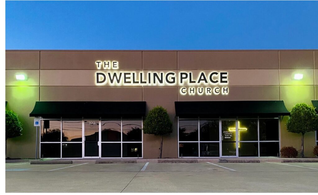
The most effective signs complement their surroundings while standing out enough to capture attention. Consider architectural elements, neighboring signage, and natural lighting conditions when developing your design. A sign that looks perfect in isolation might lose impact when competing with its environment.
The Digital Dimension
Modern sign design often needs to translate effectively between physical and digital spaces. We ensure designs maintain their impact across various media, from storefront signs to social media profiles. This consistency strengthens brand recognition and maximizes your marketing investment.
Measuring Success
The true test of sign design comes after installation. We help clients evaluate performance through various metrics, from customer feedback to foot traffic changes. This data-driven approach allows for refinements that optimize impact over time.
Ready to create signage that captures attention and drives business growth? Contact Pegasus Signs & Printing to schedule a consultation with our design team. We’ll help you develop signs that not only look stunning but also deliver measurable results for your business.
